<img src="
e.deviantart.net/emoticons/s/s…" width="30" height="30" alt="

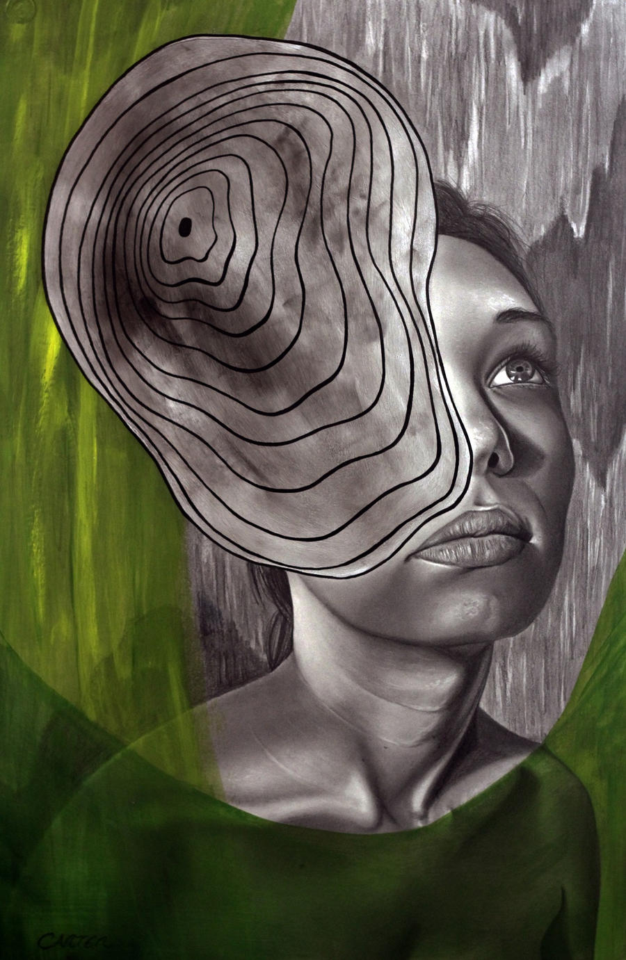
" title="Sun"/> You definitely have your own vision; whether this is one of a series or a point of view indicative a the direction you're going now or simply an experiment, it works on several levels.
<img src="
e.deviantart.net/emoticons/s/s…" width="17" height="16" alt="

" title="Star!"/> First is the obvious: we can recognize and empathize with the slightly distorted but basically realistic female subject; secondly, there is the 2-dimensional space in the background [also black and white] adjacent to the portrait and a part of the same rendering space. Although it's related, the treatment has distinctions. The texture and vertical strokes along with the silhouetted shapes have a graphic art feel as opposed to the more volumetric rendering of the main subject.
<img src="
e.deviantart.net/emoticons/s/s…" width="17" height="16" alt="
" title="Star!"/> Next, the layers in front are transparent cut-out shapes that add color, obscure part of the figure, and frame the center of interest. The fact that there are 2 that overlap forces a comparison between 2d and 3d space in a way that 1 transparent shape would only hint at.
<img src="
e.deviantart.net/emoticons/s/s…" width="17" height="16" alt="
" title="Star!"/> Lastly, the design on top resembles a cross between an amoeba and a topographic maps. Such maps have the interesting feature of being seen either as 2d shapes or provoking the illusion of 3 dimensions, thus tying disparate elements together. Nicely done.
<img src="
e.deviantart.net/emoticons/s/s…" width="17" height="16" alt="
" title="Star!"/> The above is only a description. Over-all, this pace works well.
<img src="
e.deviantart.net/emoticons/s/s…" width="17" height="16" alt="
" title="Star!"/> Help: There are a few places where the light is too bright on the neck and collarbone than warrants for their proximity to the light source. Also the bright edge lighting belies a photo reference or at least adherence to photographic qualities which in my opinion weaken the rendering. Edges always darken. Light from an edge can't reach the human eye in full force due to the angle of incidence. Reflected light should be placed off the main edge and be substantially dimmer than the main light source.
Final Analysis: Good work. You have room to improve, but Artistically a success!
Keep going.<img src="
e.deviantart.net/emoticons/s/s…" width="30" height="30" alt="
" title="Sun"/>